
How the Substack Website and Mobile App Are Vastly Different: A Simple Writer's Guide
You built an entire publication, but plot twist: readers may be experiencing it one post, Note, or comment at a time on the app

Both Substack desktop and mobile app have value, but they don’t show our work in the same way. If you’re building your Substack on the website itself (meaning Substack.com), make sure you understand what your mobile app readers see, because it’s not the same.
I’m giving you the desktop perspective, as that’s how I mostly use the platform. I’ve added a few 🤔 on what stumps me.

💥 Shout-out to my exclusive advertising sponsor, the always-free Booklinker (universal book links—so helpful!), and the paid tool, GeniusLink. I love and use both💥 (affiliate link).
Because I work from my computer, I view my Substack as a full website (not my actual site, badredheadmedia.com), with a homepage, About page, archive, sections, branding, featured posts, and a navigation bar I’ve arranged to help people find what they need, including my free Substack Tips section.
Below: This is what people see on the desktop version. See the toolbar across the top? You cannot see this on the mobile app. Only on desktop. 🤔

Below: This is my entire home page on desktop, which is also not viewable this way on the mobile app. 🤔
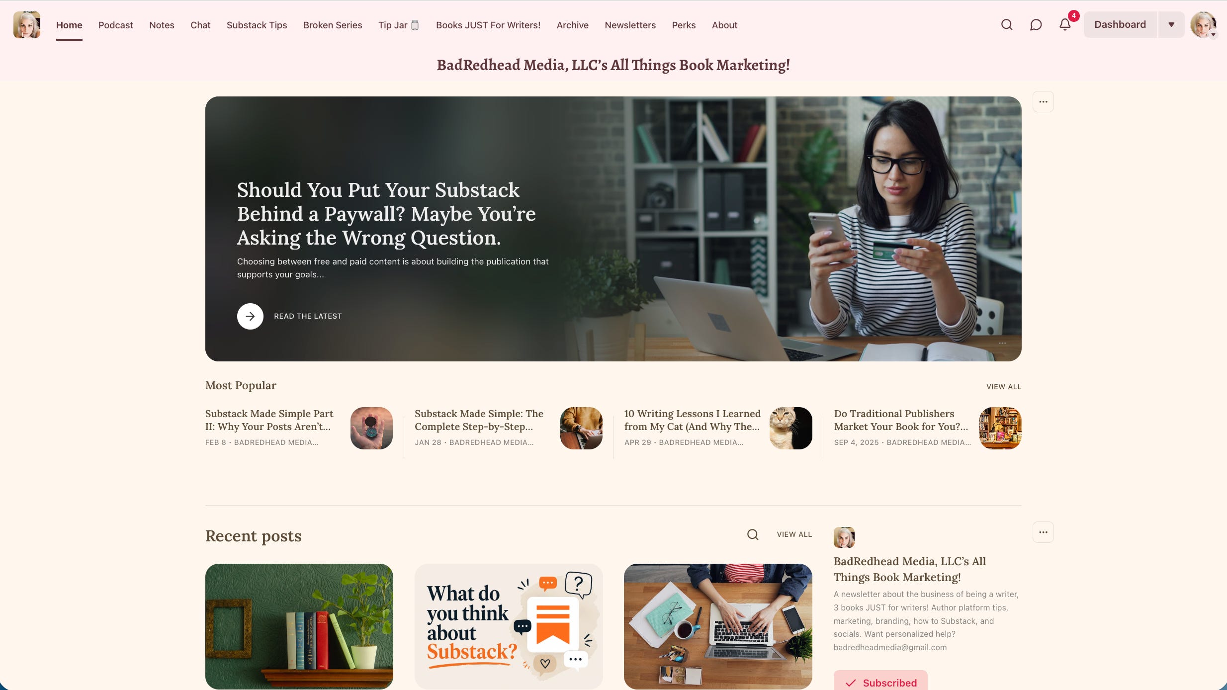
🤔 Then I open the Substack mobile app and wonder where everything went. 🤔
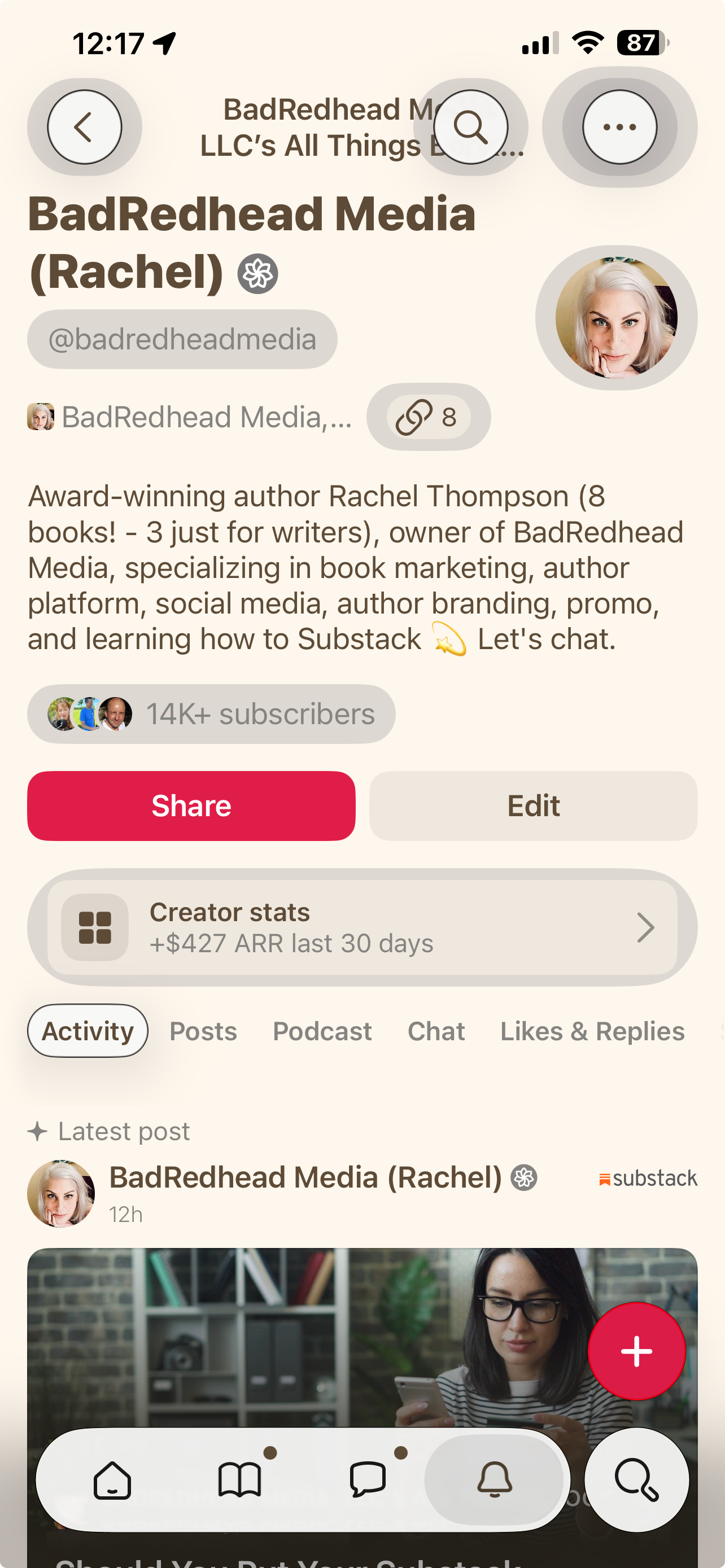
All activity is shown in the Activity tab by default, so Notes appear there and are not labeled as Notes because that would make too much sense. 🤔
Posts show your publication posts (aka articles, aka newsletters).
Your Substack Website Shows the Full Publication
Substack gives writers a surprising amount of control over our online publication websites. We can customize colors, fonts, logo, wordmark, header, homepage layout, featured content, and footer.
The website has a navigation bar that includes Home, Archive, and About by default. You can add links to pages on or off Substack, as well as custom pages, tags, sections, podcasts, Chat, and reader referrals, when you enable those features.
The Substack App Is Built Around Reading and Discovery
I understand why people enjoy the app. I use it, too. It’s convenient and social, and I find it much easier for conversations and interactions.
The desktop is built for creators, while the app is built for readers.
The problem is that readers may discover one piece of your work without seeing the larger publication behind it. They may enjoy what they read without realizing that you have an entire section devoted to that subject, like my Substack Tips!
Sections Aren’t Separated in the App
Another annoyance: According to Substack’s help documentation, sections are not separated in the mobile app. (My Substack Tips are a Section.) When someone views your publication on the mobile app, they see all its posts mushed together, not divided into sections. 🤔
Sections aren’t merely folders for writers who enjoy organizing things. What, we exist. Substack defines them as additional newsletters within one publication.
I have separate sections because not every subscriber comes to me for exactly the same info. On my publication website, those sections appear in my navigation bar as shown above; in the app, readers don’t get that same experience. Like, at all.
The Website Navigation Is Not the App Experience
Substack allows us to customize our website navigation, add outside links, arrange our homepage, pick fonts and colors, and choose how different groups of posts appear (all in your Publication settings).
The app does not reproduce the custom website we created.
Doesn’t make the app bad; makes it different. The problem arises when writers assume app readers see the same homepage, navigation, sections, and overall publication structure as website visitors. They don’t.
I didn’t know this at first either. I’d suggest someone visit my Substack Tips section, or the Broken series page to find out more about my poetry and essays, and they’d come back and say, “Great, but um, like, where?”
I didn’t know they couldn’t see any of my navigation options in the mobile app! Doh.
When you click the link on mobile, you only see my profile. No Substack Tips to be found. Bummer. 🤔

Write From the App or a Mobile Browser
Substack supports writing and publishing posts from both its iOS and Android apps. Drafts sync across the web and app, so you can begin writing on one and finish on the other. Handy.
You can also open the browser on your phone or tablet, go to Substack.com, sign in, and create or publish a post through the mobile website (different than the app).
If a phone or tablet is your only option, go for it. Publishing itself is not limited to desktop use, which, from an accessibility perspective, makes my heart happy.
Add Directions Inside Your Posts
Because app readers may not see your website navigation or sections, build a few directions into the posts themselves. If you mention an older article on book marketing, link directly to it. If you have a section devoted to the subject, link directly to that section.
We can show people where the door is. We can’t physically drag them through it, which is probably for the best, like, legally and stuff. Stop assuming the app shows them a door that isn’t there.
How do you usually read Substack: through email, on a publication’s website, or in the app? If you’re a writer, have you looked at your work in both places?
Resources
Viveka Van Rosen here on Substack
I sure wish the mobile app delivered the same experience for creators as it does for readers, not that The Substack Gods have asked me.
Your thoughts?
🌻 If my work has saved you time, money, or prevented one small marketing-related nervous breakdown, becoming a paid subscriber helps me continue creating. I’m glad you’re here.
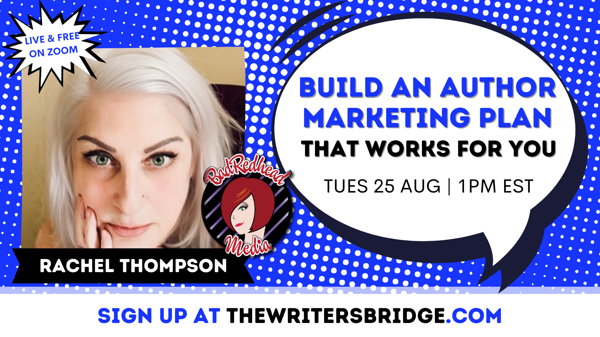
🥳 So excited to be the featured guest speaker for The Writers’ Bridge this month! Hundreds of writers attend this free monthly Zoom series, so no pressure or anything: https://writingcraft.com/#The-Writers-Bridge.
Please sign up (it's totally free, on Zoom, and nothing fancy required). Thanks to Allison K Williams for inviting me!
Rachel knows this. My comment is for Rachel-fans -- whenever you post an ARTICLE [not a "note"], Substack will send you a choice of "Shareable Assets." Since these are customized for mobile-phone viewers, the limitations are obvious: titles chopped off, only the center of an image displayed, etc. etc.
* * Suggestion: view Substack on your desktop now and then for the "full Rachel experience."
The app is nice for reading but I find it useless for creating content. I use my computer to manage and create posts, whether Notes or my weekly column. The desktop tool set is pretty nice.
The big change I would like to see is much better syncing between desktop and the app.